ux-patterns
SEO Preview Images
Map of content and moodboard for link previews: the image, title and description that appear when a URL is pasted into Slack, Zoom, X, LinkedIn, WhatsApp or iMessage. These come from the Open Graph og:image and twitter:card tags.
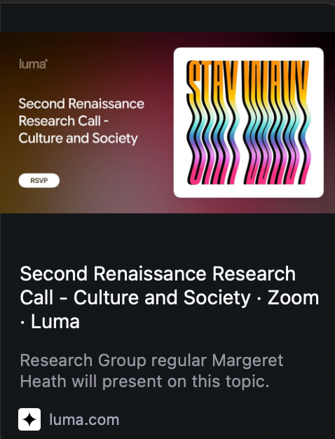
The images here are each site’s actual og:image, fetched 2026-10-23. Started from Luma, whose event previews look great in Zoom chat:
Start here if you’re building previews: Design brief, reusable patterns for any project.
See also: How previews vary from page to page, the same question asked of blog posts, docs pages and wiki notes on 26 sites, with what it means for Flowershow.
What makes a good one
- It’s generated from the page, not a site-wide logo. The best ones (Luma, GitHub, Maggie Appleton) are one template filled per page, so every link has its own preview.
- It’s a composed card, not a raw photo. Big title, one small brand mark, one image or illustration. Readable at about 300px wide, the size it shows in chat.
- Key content sits in the centre. Platforms crop differently (see below).
- One idea, high contrast. Busy screenshots turn to mush at thumbnail size.
- Title and description work without the image:
Page title · Siteplus one human sentence.
Generated per page: the card is built from the page’s own data
The strongest pattern. One template, filled per page with title, description, stats or a poster. Every link gets its own good preview without anyone designing it.

Luma event
Event title + RSVP pill + the event's poster framed on the right. Dark gradient pulled from the poster.
luma.com →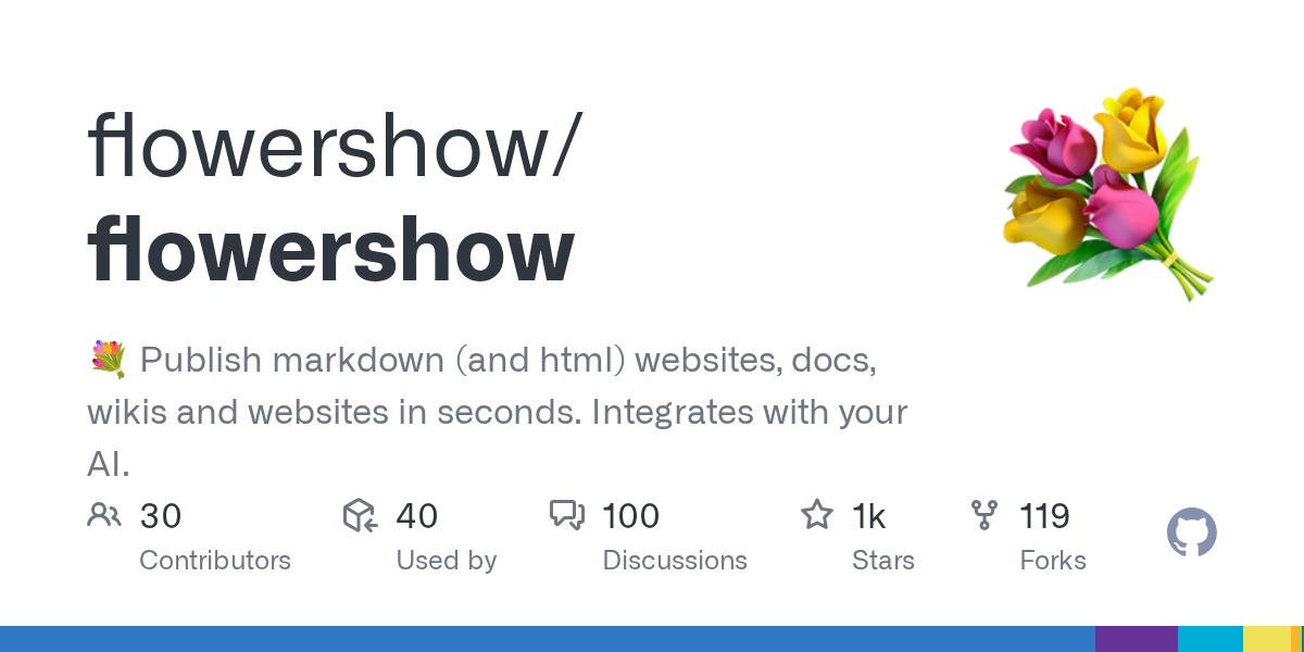
GitHub repo (default)
Owner/repo in big type, description, avatar, then contributors / issues / stars / forks. Information-dense but calm.
github.com →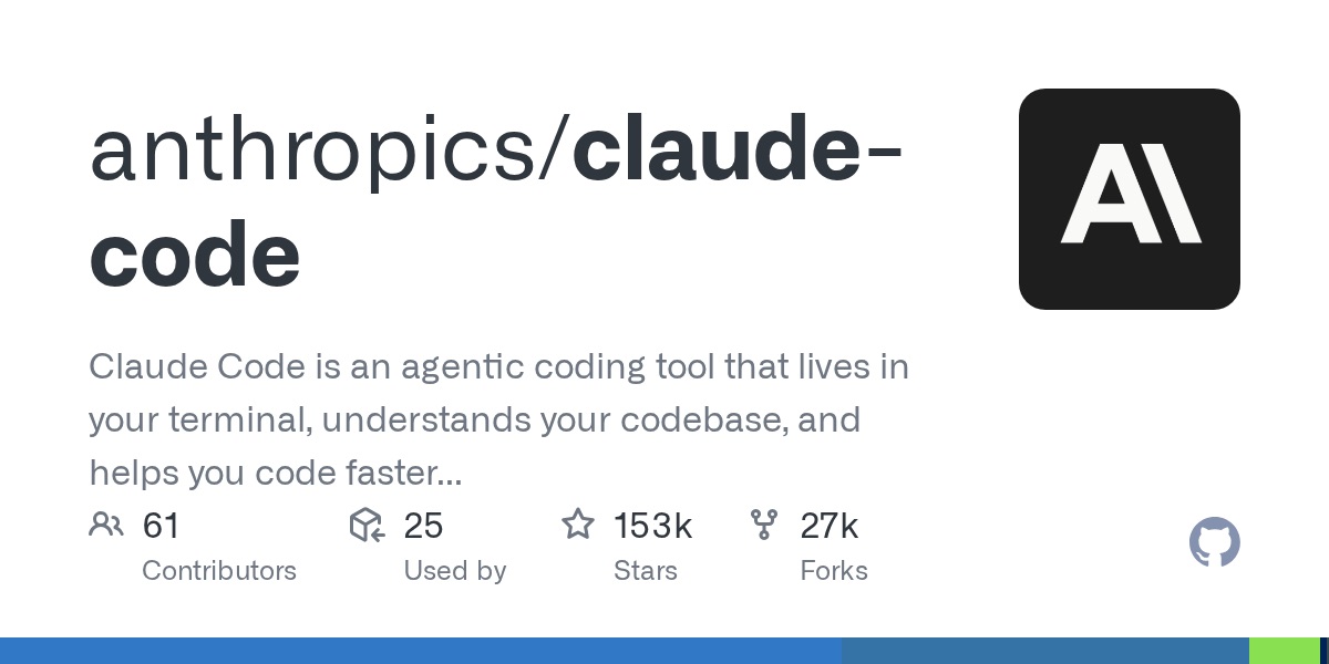
GitHub repo (another)
Same template; the org avatar is the only branding. Shows how consistent a generated card can be.
github.com →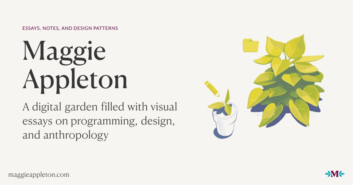
Maggie Appleton
Serif title, short description and a hand-drawn plant, from a generated `/og.png?title=…&description=…`. Garden-like and personal.
maggieappleton.com →
Linear changelog
`/api/og/generic?title=Changelog`: logo + one word on black. Austere template that works for every page.
linear.app →Illustrated and editorial
A commissioned picture. Reads as a magazine cover, so it stands out in a feed of screenshots.
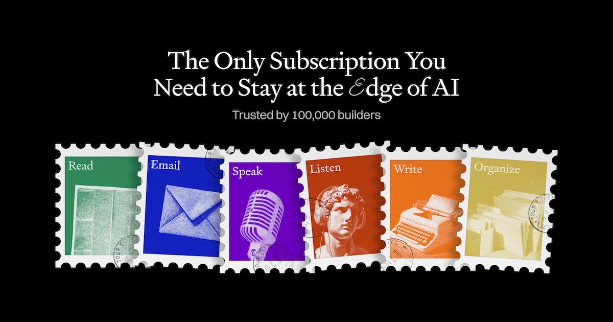
Every
Row of illustrated postage stamps under a serif headline. Editorial, warm, very un-SaaS.
every.to →
Cloudflare blog post
Each post gets its own flat illustration in a fixed pastel style. Recognisable before you read the title.
blog.cloudflare.com →
PostHog
Their hedgehog mascot plus a big yellow headline. Brand-led and funny, and consistent across the site.
posthog.com →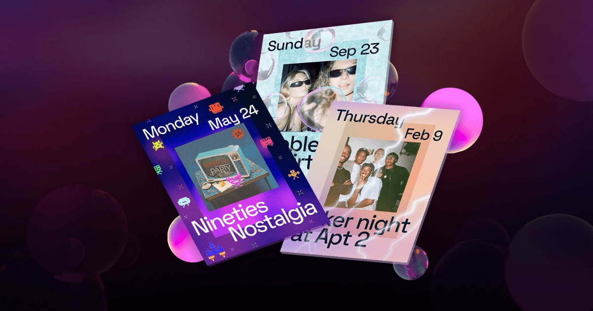
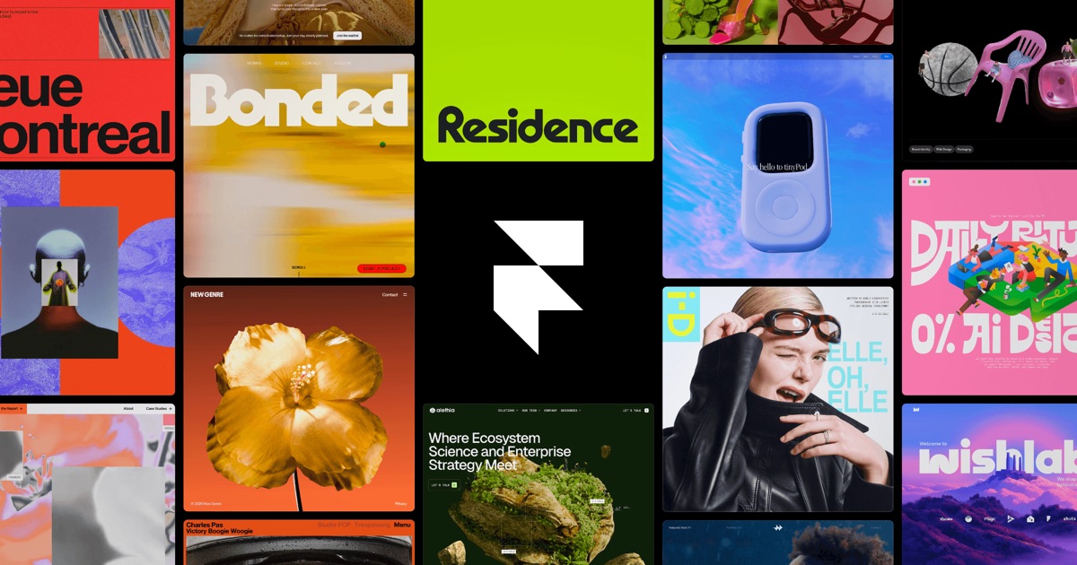
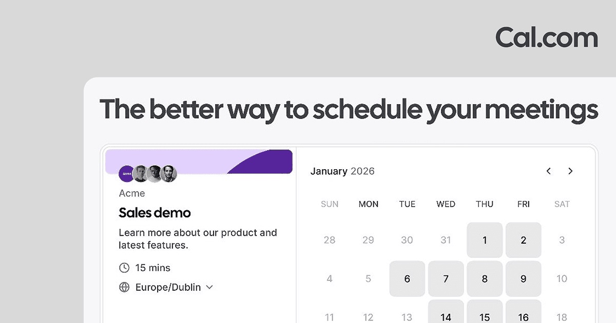
Product UI as the image
A cropped, polished screenshot. Fine for landing pages; weaker for content pages.
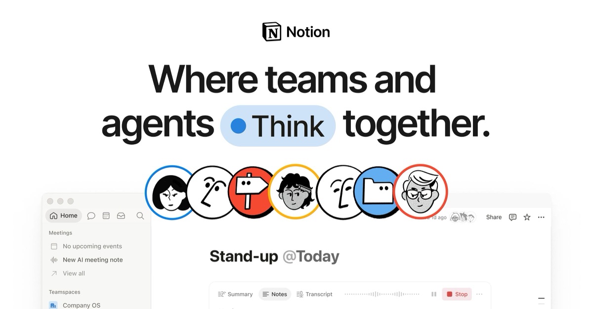
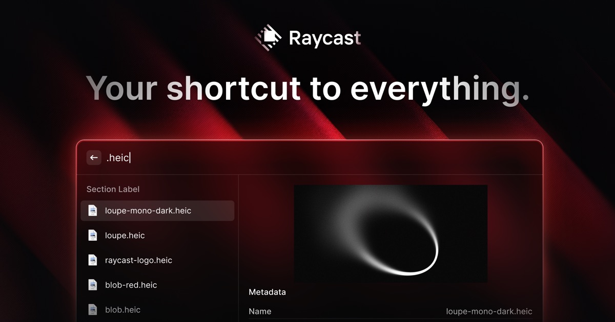

Minimal brand mark
Just the logo or one line. Safe and elegant, but every page looks the same, so it says nothing about the page being shared.
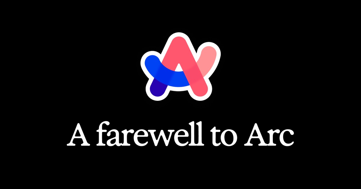
Arc (farewell)
Logo + one serif line on black: "A farewell to Arc". A minimal card can still carry a message.
arc.net →
Next.js 15
Version lock-up with thin construction lines. Turns a release into an event.
nextjs.org →

Stripe Press
Tiny gold mark on black. Bookish restraint, maybe too small to read at chat size.
press.stripe.com →
The content is the image
Media sites just use the thing itself. Hard to beat when you have it.


Counter-examples
What to avoid.

Substack publication home
400×400 logo, which platforms show as a small thumbnail or stretch. Individual Substack posts do better.
lennysnewsletter.com →
Gwern
Tall 1238×1400 logo: the wrong shape for a 1.91:1 slot, so it gets cropped or letterboxed. The site is lovely; the card isn't.
gwern.net →
Vercel blog post
This (older) post falls back to the site-wide triangle. Recent Vercel posts do get their own art ([per-page study](/ux-patterns/seo-preview-images/per-page-variation.html)), so it's an inconsistency, not a policy.
vercel.com →Sizes and crops
- Make it 1200×630 (1.91:1). It’s the common default: Facebook, LinkedIn, Slack, Discord and X
summary_large_imageall take it. Retina-minded sites (Raycast, Anthropic, Framer) serve 2400×1260. - Add
og:image:width/og:image:heightso platforms can lay out the card before the image loads. twitter:card=summary_large_imagefor the big card;summarygives a small square thumbnail.- Crops vary by platform. Zoom chat and X are wide; WhatsApp and iMessage often crop square or show a thumbnail. Luma’s own image shows the problem. Here is the same image at 1200×630 and cropped square by its CDN:
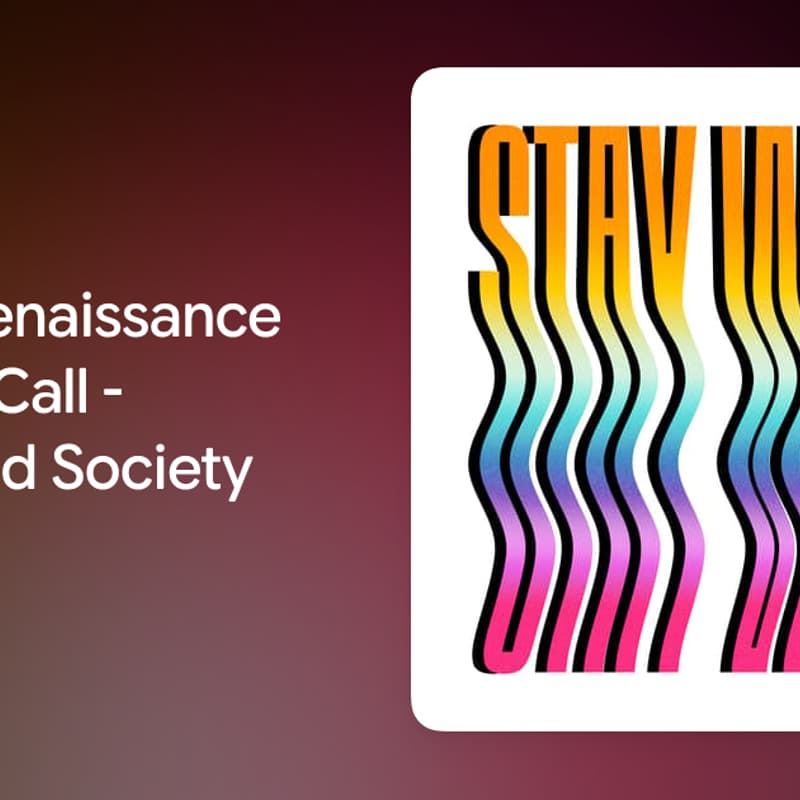
The square crop cuts the title. Keep the essentials in the centre square (about 630×630) if WhatsApp matters.
Tools
- Preview across platforms: opengraph.xyz, LinkedIn Post Inspector, and paste the link into a Slack DM to yourself.
- Generate per page: Vercel OG /
@vercel/og(JSX to PNG, used by Next.jsopengraph-image), Satori, or a Cloudflare Worker. Luma and Linear both use a URL-parameterised endpoint (/og?title=…). - Resize on the fly: Luma serves one master image through Cloudflare image resizing (
width=,height=,fit=cover).
How to add an example
Fetch the page’s og:image (e.g. curl -sL URL | grep og:image), save it to images/{slug}.jpg at 1200px wide, and add a card to the right section. If you have a screenshot of how the preview looked in a real chat, add that too; it shows the crop, which the raw image doesn’t.